
Building a Consistent Brand Visual System That Scales With AI
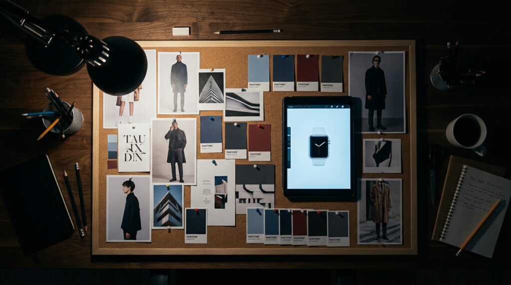
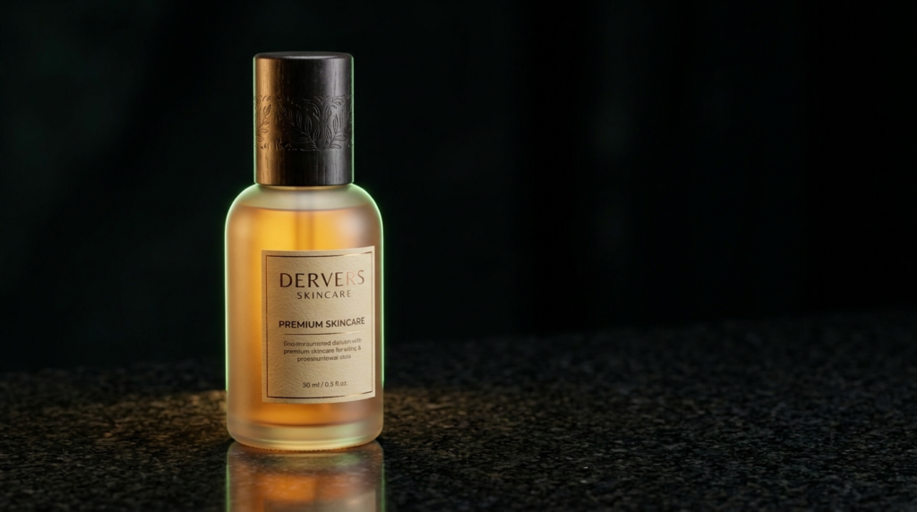
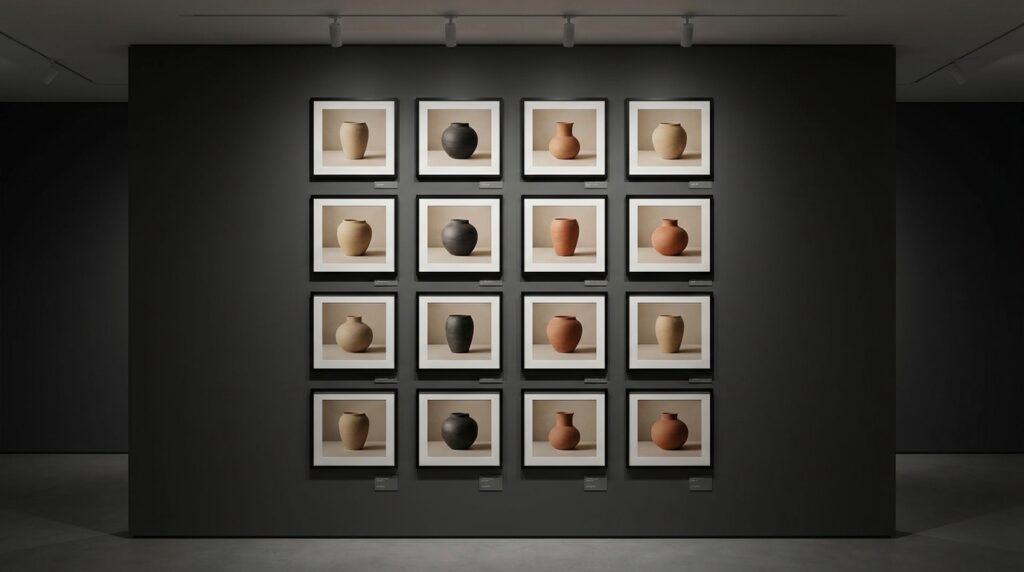
Scaling content production almost always creates a visual consistency problem before anyone notices it’s happening. A brand that looked cohesive with 20 pieces of content a month starts to fragment at 100 — different lighting styles, inconsistent color grading, product shots that feel like they came from three different photographers, because they usually did. AI production doesn’t automatically fix this. Left unmanaged, it can make it worse, since generation makes it easier than ever to produce a lot of visually inconsistent content fast. The fix isn’t slowing down production. It’s building a visual system that any piece of content — human-shot or AI-generated — gets checked against before it ships. What actually belongs in a brand visual system A usable visual system is more specific than a typical brand guideline PDF. Beyond logo usage and a color palette, it should define: Lighting direction and quality — soft and diffused vs. hard and directional, warm vs. cool color temperature Composition rules — how much negative space, where the product sits in frame, whether backgrounds are ever busy or always minimal Color grade — the specific tonal treatment applied consistently across every asset, not just the brand’s primary color palette Texture and material language — matte vs. glossy surfaces, natural vs. synthetic materials in the scene A reference set — 8-12 images that exemplify the system in practice, that any producer or model can be pointed at directly This level of specificity matters more for AI production than traditional photography, because a generation model has no implicit understanding of “how we usually do things” the way a photographer who’s worked with a brand for two years does. Every constraint that lives only in someone’s head needs to be written down and turned into reference material. Building it from what already exists Most brands don’t need to invent a visual system from scratch — they need to formalize the one already implicit in their best-performing content. The practical process: pull the 15-20 highest-performing visual assets from the last year, across whatever platforms matter most, and look for what they actually share. It’s rarely the obvious brand elements; it’s usually a consistent lighting mood, a repeated composition style, or a specific way products are framed. That pattern, made explicit, becomes the system. Making the system usable, not just documented A visual system that lives in a static PDF nobody opens doesn’t scale. The systems that actually hold up in production are built as an active reference library — a folder of annotated example images that gets attached to every brief, every generation prompt, every review checklist. The goal isn’t a document that describes the brand’s look; it’s a set of concrete references specific enough that a new producer, a new AI workflow, or a new agency partner can match the standard on day one without months of osmosis. Where this pays off The brands that invest in this early are the ones whose content still looks like one brand at 10x the volume. It’s the difference between a feed that reads as a considered brand and one that reads as a pile of individually fine but collectively disjointed images. If you want help auditing your existing content for the system that’s already implicit in it, we can pull that together with you.