

Godín Taquería
The Challenge
Godín needed to stand out in a city saturated with taquerías that all look the same — same typography, same color clichés, same stock tacos photography. Great food, zero visual identity to match it.
The Strategy
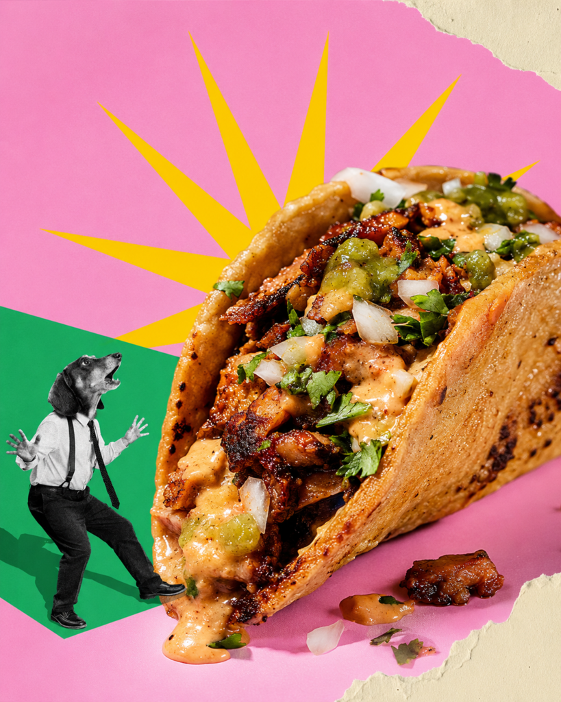
We built a mascot-led identity system: sharp-dressed animal characters in vintage suits, a loud color-blocked palette, and hand-lettered type that feels more streetwear than street food. Every touchpoint became something worth photographing.
 Packaging System
Brand
Identity.
Mascot Character Design
A cast of sharp-dressed animal characters gave Godín a face customers remember and want to post.
Packaging & Collateral
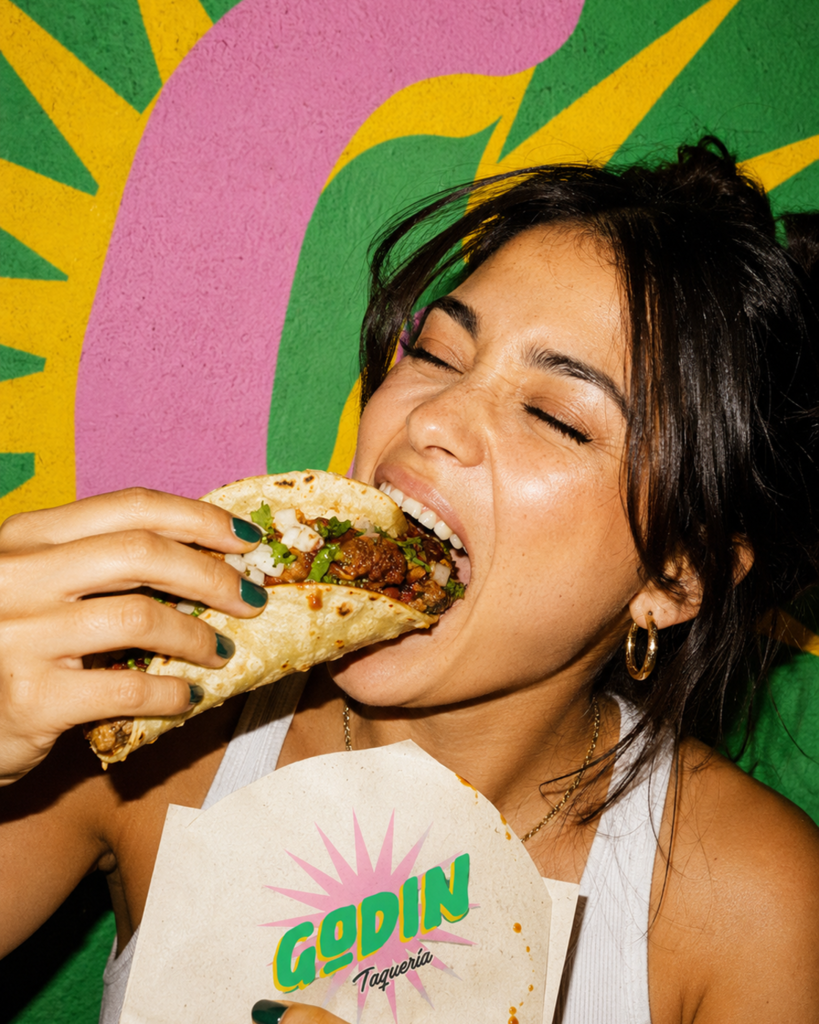
Bags, napkins, and cups redesigned as a cohesive system built for real-world photography, not just a logo sheet.
The Impact
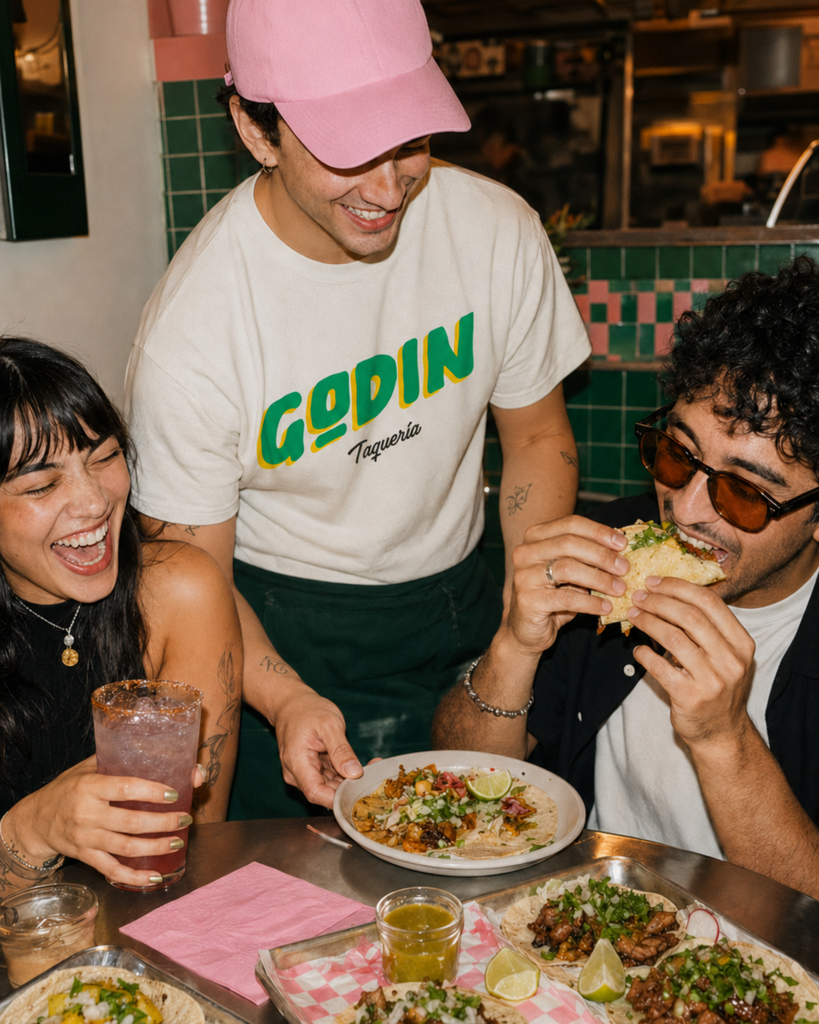
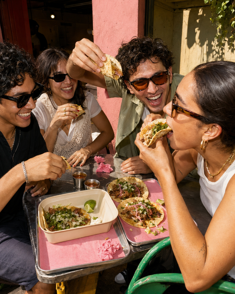
The new identity turned Godín's packaging into free marketing — every order left the counter as a piece of content.


