
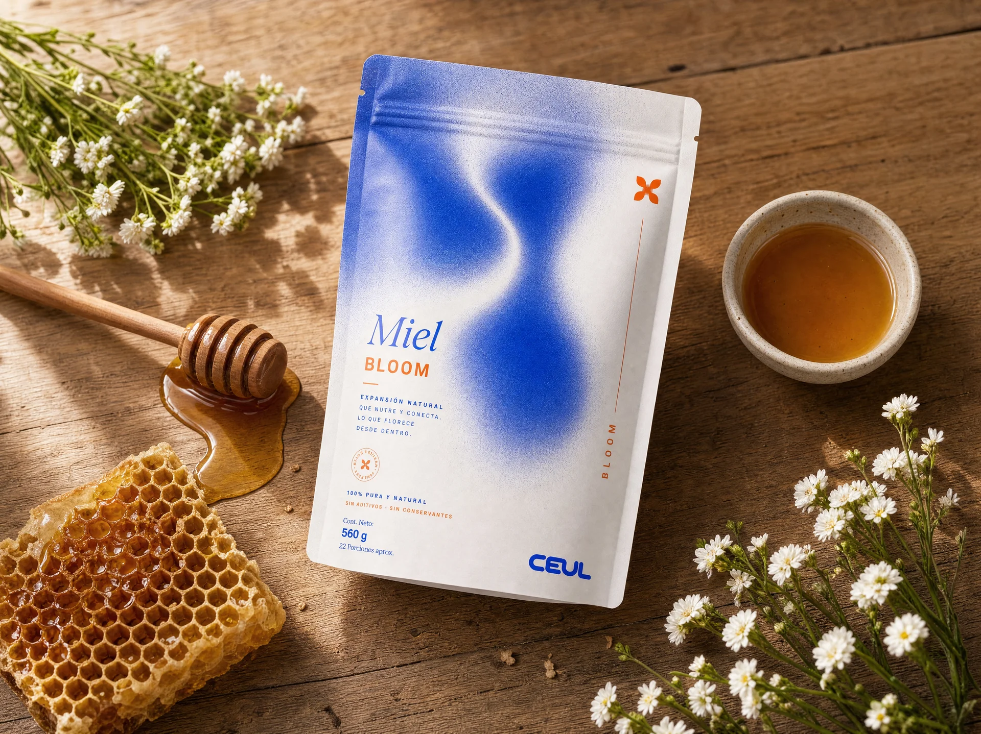
Branding
CEUL
The Challenge
Wellness recovery is one of the most crowded categories in consumer health, usually reduced to either clinical sterility or vague self-care language. The challenge: build a brand that feels scientific without feeling cold, that treats recovery as an active, intelligent process rather than a passive indulgence, and that earns trust through clarity rather than borrowed credibility.
01
Phase One: Brand Foundations
The Strategy
We built the identity around a single idea: recovery you can feel, not one you have to explain. A cool, confident blue system signals precision and calm, while a four-part naming architecture, Pulse, Orbit, Bloom, Core, turns each product into a distinct part of one coherent recovery language.
Recovery System
Brand Identity System
Creative
Execution.
Logo & Wordmark
A rounded, confident wordmark built to hold up at any scale, from packaging to app icon.
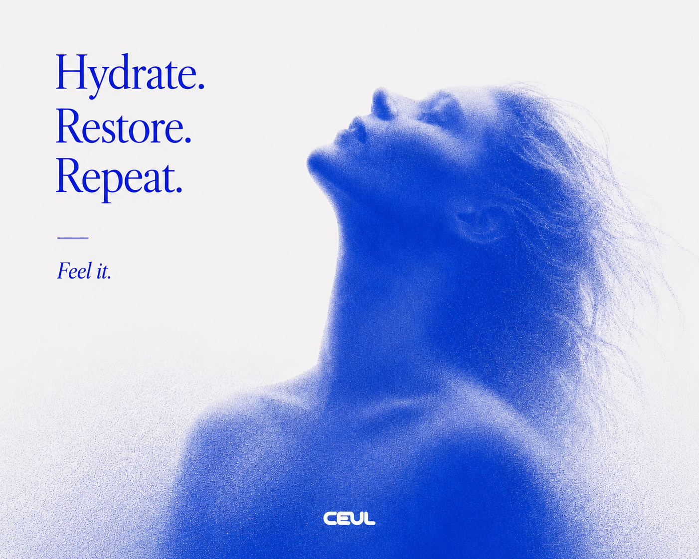
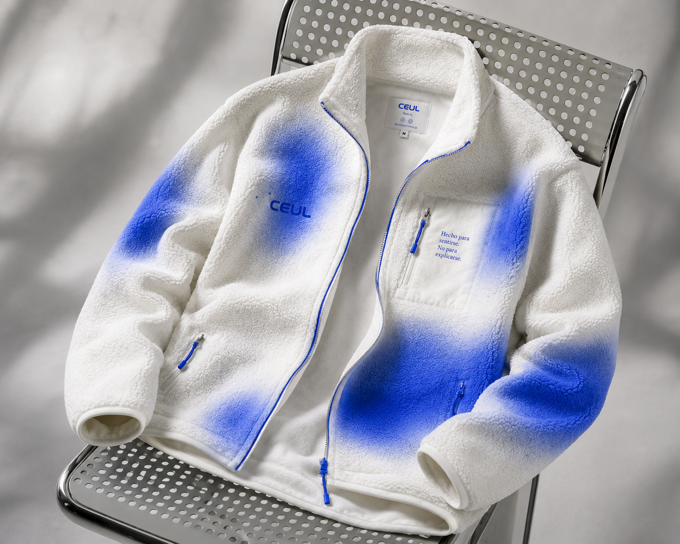
The Impact
A brand identity built to hold up across packaging, digital, and retail, designed so CEUL can scale into new products without losing a coherent voice.
Build Your
Brand.


