
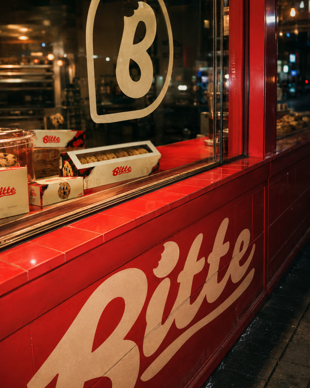
BRAND IDENTITY CASE STUDY
Bitte
ONLINE ORDERS2.1x
SOCIAL ENGAGEMENT+160%
The Challenge
Bitte made genuinely great cookies, but its visuals looked like every other home-bakery feed — soft pastels, flat-lay shots, nothing that stopped the scroll.
The Strategy
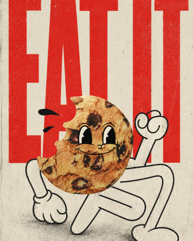
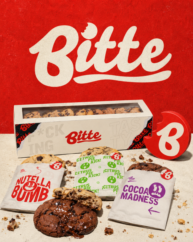
We gave Bitte a loud, retro poster identity — oversized script type, torn-paper textures, high-contrast color — so a single cookie photo could carry the same energy as a concert flyer.
 Poster Identity System
VISUAL IDENTITY SYSTEM Brand
Brand
Identity.
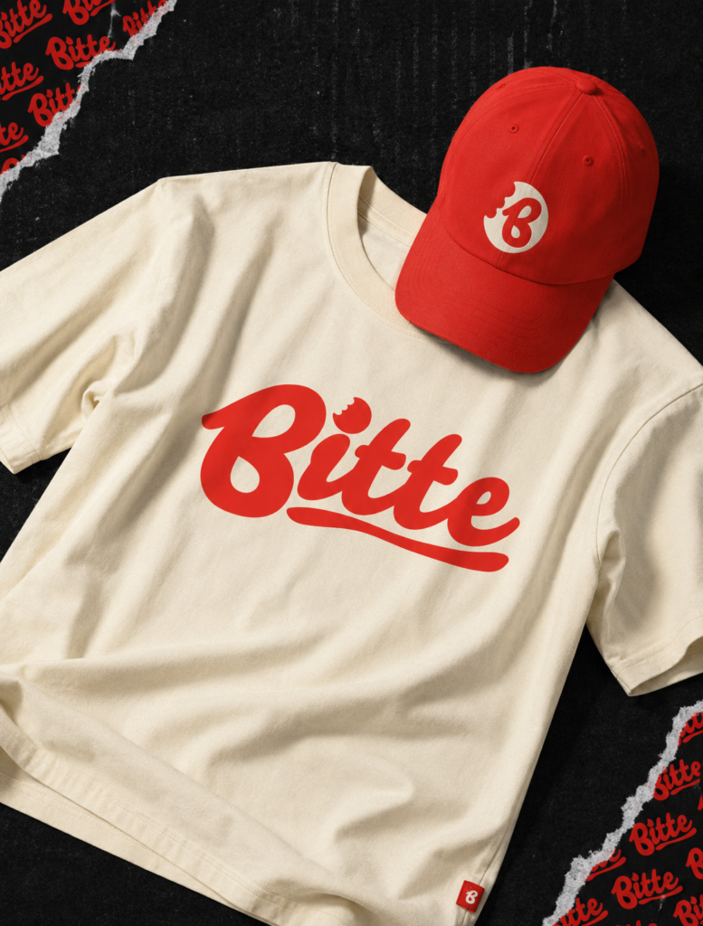
Logotype & Type System
A hand-styled script logo built to dominate packaging, stories, and print at any size.
Content Direction
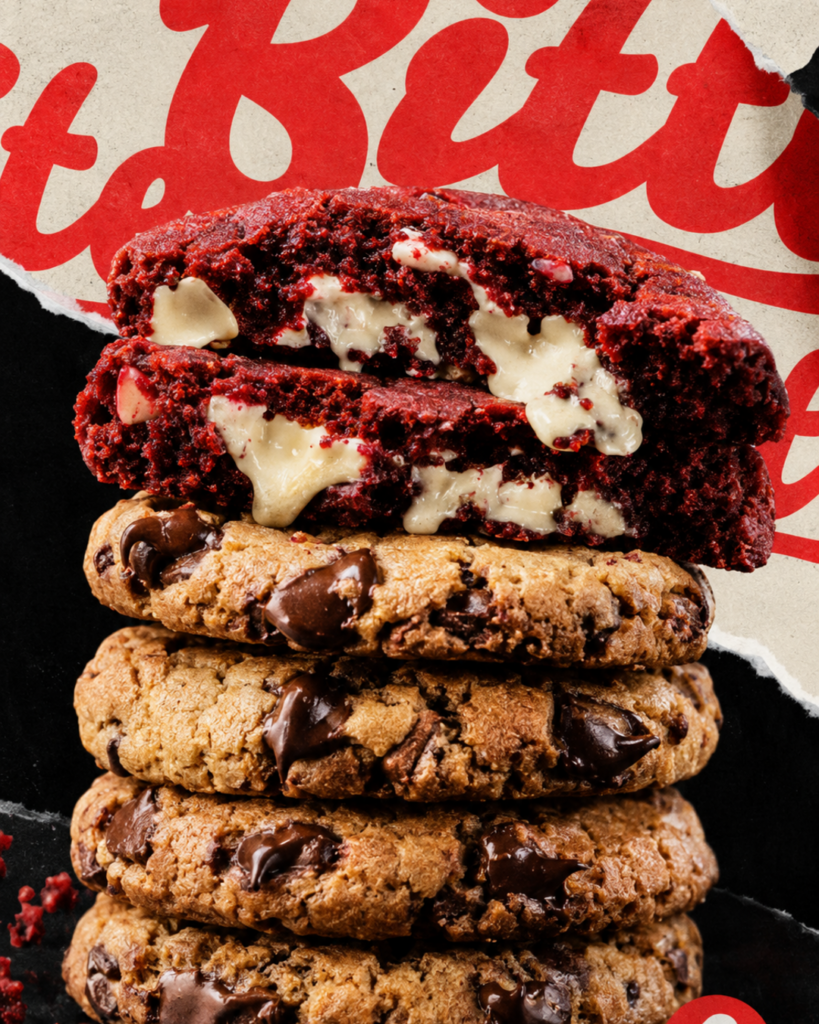
A repeatable visual formula for product drops that reads as Bitte from the first frame.
The Impact
Bitte's feed stopped looking like a home-bakery account and started looking like a brand.
2.1xONLINE ORDERS
+160%SOCIAL ENGAGEMENT


