
BRAND STRATEGY CASE STUDY
CEUL
BRAND RECALL4.8x
REPEAT PURCHASE+92%
The Challenge
CEUL had a strong product but a brand voice that tried to explain itself in every sentence — over-describing a feeling that should have been obvious at a glance.
The Strategy
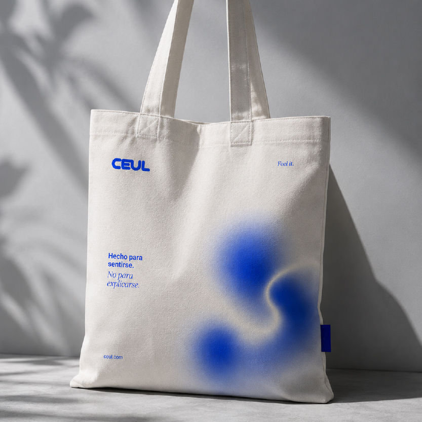
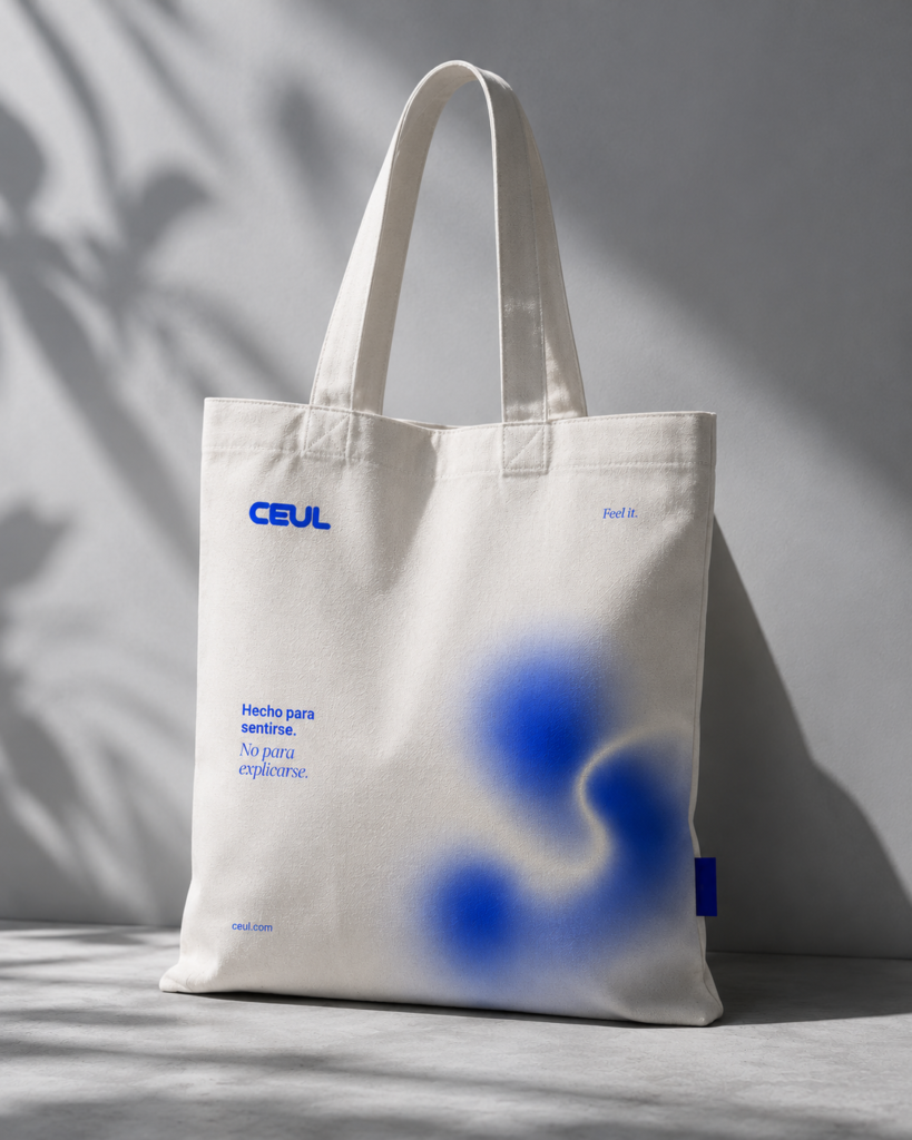
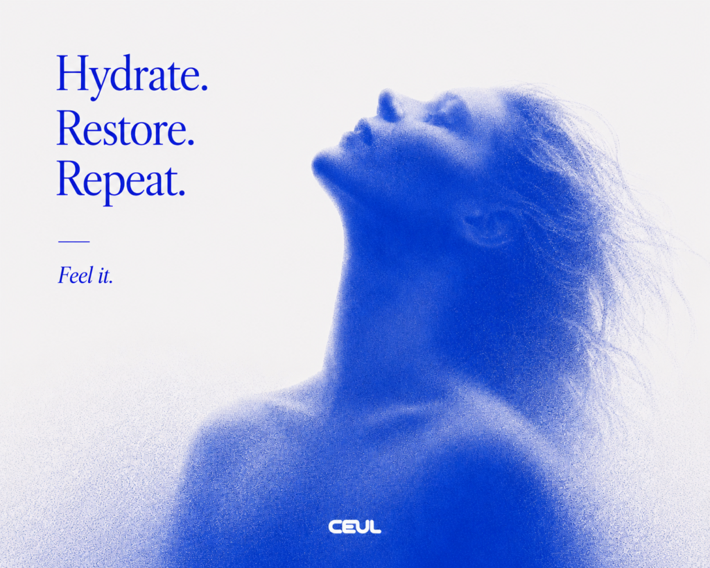
We stripped the brand down to a single idea — 'made to be felt, not explained' — and let restraint do the talking: one blurred mark, one line of copy, generous white space across every touchpoint.
 Minimal Brand System
VISUAL AUTHORITY SYSTEM Creative
Creative
Execution.
Identity & Mark
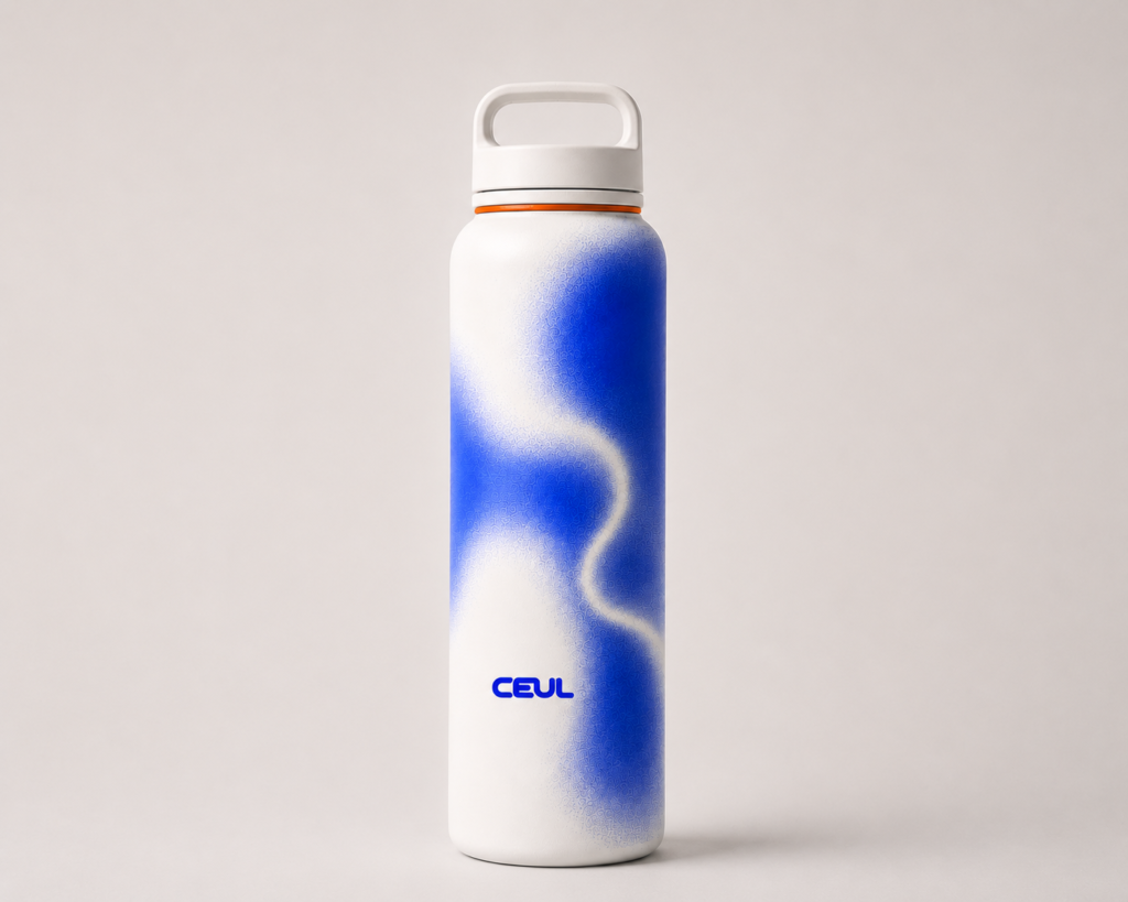
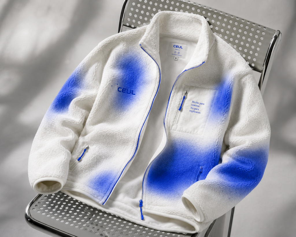
A single soft-edged blue mark became CEUL's signature — instantly recognizable without a wordmark attached.
Product Photography
Clean, tactile product imagery that lets the material and the message speak for themselves.
The Impact
By saying less, CEUL became easier to remember — and easier to trust.
4.8xBRAND RECALL
+92%REPEAT PURCHASE


